Parallel Coordinates
The number of dimensions that can be visualized using the Parallel Coordinate Plot is not restricted. Each dimension is visualized on a vertical axis and each data point is shown as a poly-line connecting the respective values on the vertical axis. Here we use the Parallel Coordinate plot to evaluate the Pareto optimal solutions.
New Plot - Parallel Coordinates
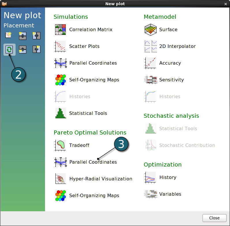
- Click on the New Plot icon in the menu bar - (or click on the Open the viewer icon on the Home Screen Process Flowchart).
A New Plot window shall open.
- Select Replace current plot icon.
- Select Parallel Coordinates under Pareto Optimal Solutions.


Parallel Coordinates Settings
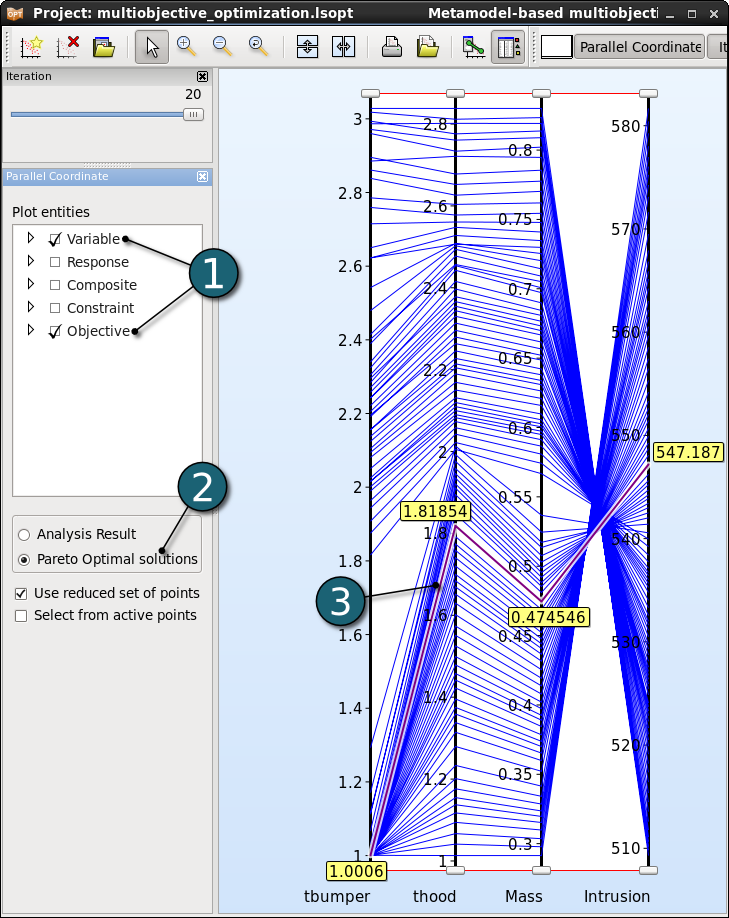
- Select the Plot entities as the both design variables and the both objectives.
- Select Pareto Optimal solutions.
- Selected points are colored in purple. If only a single point is selected, the corresponding value for each entity is displayed in the plot.

Adjusting the Ranges
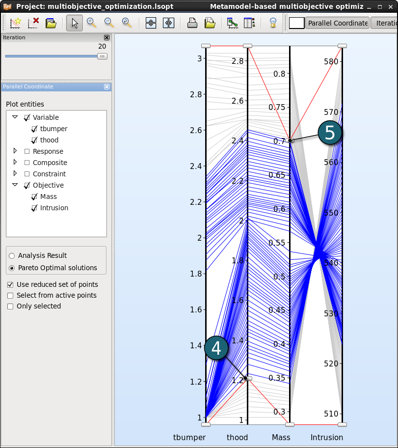
The ranges of the entities may be changed interavtively using the sliders at the ends of each vertical axis rendering the points outside the ranges unselectable. Points within the selected ranges are colored in blue, while the remaining points are colored in grey.
- Changing the lower bound of an entity.
- Changing the upper bound of an entity.
- We may easily reduce the data by adapting the ranges of all entities interactively, what is helpful in decision making.
- But the parallel coordinate plot offers no information on the trends.

